CSS shadows are used to add depth and dimension to elements on a webpage. They can be used to create a subtle drop shadow effect or a more dramatic shadow effect.
There are two types of CSS shadows:
- Box shadows
- Text shadows
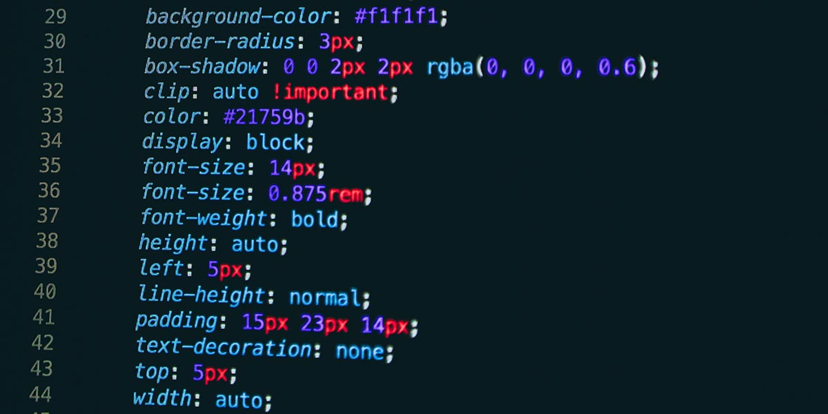
To create a box shadow, you can use the box-shadow property. The box-shadow property takes in several values, including the shadow’s horizontal offset, vertical offset, blur radius, and color.
Here is an example of a simple box shadow that adds a black shadow behind an element:
.shadow {
  box-shadow: 5px 5px 5px black;
}
You can also specify multiple box shadows to create a more complex shadow effect:
.shadow {
  box-shadow: 5px 5px 5px black, 10px 10px 10px blue;
}
To create a text shadow, you can use the text-shadow property. The text-shadow property works the same way as box-shadow, but it is applied to text rather than boxes.
Here is an example of a simple text shadow that adds a red shadow behind some text:
.shadow {
text-shadow: 2px 2px 2px red;
}
You can also specify multiple text shadows to create a more complex shadow effect:
.shadow {
  text-shadow: 2px 2px 2px red, 4px 4px 4px blue;
}